
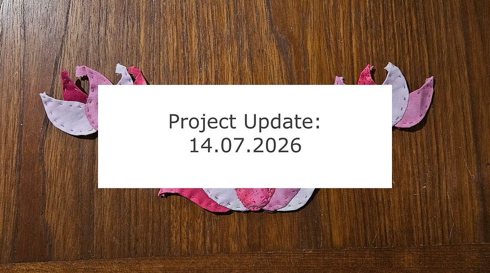
Colour Scheming: Spring Star Blocks
- vafibrearts

- Mar 26, 2024
- 6 min read
Hello Friends and Welcome Back!
With the first week of Spring now behind us, I wanted to take a look at one of the new season's goals that I've been working on!
Specifically, I'm referring to this season's blocks for the Generations Quilt! Of course, this project isn't new this season, I've been putting together blocks for several years now. My hope is that, when I'm finished, I'll have a variety of blocks that reflect my different areas of interest when it comes to fabric selection!
Right now, I'm particularly interested in colour; experimenting with colours I haven't used in the past, combining a variety of tones into something that feels both vibrant and cohesive, and using many different colours within a single block to create unique effects!
I've already started working on some blocks following these principals and I love how they're coming together, although I did run into a slight miscalculation with my background fabric. Regardless, I'm excited to share the process I went through to reach the point I'm at now!
Let's take a look!
My Process
I don't often jump into a project with a fully formed colour scheme in mind. Instead, I tend to take inspiration from photos, artwork, or a particular piece of fabric I want to include in the project.
Since I'm focused on using a variety of colours, I decided to use the Coolors website (not sponsored) to generate various colour schemes that I wouldn't normally encounter. Here are a few that I liked:


The Six Pointed Star block has six pieces used in the star, plus a square of background fabric, so I generated four-colour schemes so I would have one background colour and three to use in the star!
Since one focus I have while working on these blocks is to experiment with colour combinations I wouldn't normally think of, I decided to use whichever colour generated in the top spot of the Coolors colour scheme as my background fabric, rather than manually selecting a colour from the four myself.
It's been exciting to relinquish control like this and see how the colours work out together!
After finding over two dozen colour schemes I liked, and passing over even more that didn't catch my eye, I brought the colours into the Krita art program (also not sponsored) to make digital mock ups of the blocks. Here's an example using one of the colour schemes shown above:

This mock up uses only the four colours from the original colour scheme and creates a really cute block, but I want to take it a little further!
Another of the principals guiding this experiment is to use as many different colours within one block as possible while still keeping the design coherent, so I wanted to make each of the points of the star a different colour!
I placed the original three star colours around the star shape with a blank point between each, then used the Coolors gradient tool (still not sponsored) to find a colour that fell in the middle. My hope was that this would help colours that contrasted to blend nicely into one another.

I'm really happy with how this particular example turned out! It feels well balanced and the colour gradient flows nicely from one point to the next! But not every colour scheme mocked up as nicely.
I believe this due to the proportion of each colour used in the block; when shown as a colour scheme on Coolors, the colours are displayed in equal amount, but in the mock up, there is significantly more background fabric than there is of the star points.
A particularly drab background might bring down the vibrancy of the block and make it feel less fun and energetic than the original colour scheme, while a particularly vibrant background might wash out all the colours used in the star.
Not every experiment can be a success, but the whole purpose of mock ups is to test how colours look together before committing time and resources to making a block you won't be happy with. So any of the colour schemes that didn't make me happy when mocked up were discarded with the understanding that I may find another project they'll work better for in the future, and those that I loved became blocks!
Construction and Quantity
Before actually making any of these blocks, I had a few rules in mind regarding fabric usage and quantity of blocks.
Standard width of fabric for quilting cotton is 45", which gives me enough across the bolt for three background squares, so I plan to make three blocks of each colour scheme.
I plan to make the background square using solid fabric so the play of print and colour in the appliqued star can be the main focus of the block, and so the background doesn't feel too busy.
As for the star itself, I want to pull fabric from my remnants stash as much as possible. This way I'm using fabric I already own and am not cutting into any yardage or fat quarters, creating more remnants in the process.
However, since this method of fabric selection is very strongly focused on colour, and since I'm hoping to use new colours that I don't often work with, there is a very good chance that I won't have remnants in the exact colours I'm looking for. In those cases, I will look first to my fat quarter stash so as to not buy new fabric, but will purchase when necessary to maintain the proper play of colours.
First Star Block
The first colour scheme I made into a block uses a combination of greens, yellows, and oranges. It's a colour combination that I've always loved, reminding me of pumpkins growing on their vines, but which I've never used together in a quilt before!

I was able to get all of the fabric needed for the points of the star from my remnants and found a solid background at my local quilt store that will work nicely! Unfortunately, I made a miscalculation when ordering, so I didn't buy enough of the background fabric and will need to get more before I can applique my stars, whoops!

Regardless of that little error, I'm really happy with how the colours are playing together and can't wait to finish these blocks!
Second Star Block
This next colour scheme uses a really beautiful combination of pale greens and earth tones to create the most neutral of my selections.

For this block, I was able to get all my star fabrics from my existing stash, but did need to use a few fat quarters to get the exact shades of green I was looking for.

Again, I bought the wrong amount of background fabric for these blocks, so I'll need to head back to the quilt store before I can finish them, but I can really see how beautifully they're coming together and I love the rich combination of tones they use!
Third Star Block
The third colour combination feels the least experimental in hindsight. It uses a mix of pale greens, teals, and pinks that are reminiscent of the greens and pinks used in my Stars of the Lily Pond quilt, but in a more desaturated value.

I would have liked to be able to use remnants for this colour scheme, but pink is still a fairly new colour to me and most of the quilts I've used it in are still in progress. However teals and sea foam tones are fairly common in my collection, so I've assembled a mix of new and stash fabric for these blocks.

I haven't yet cut the pieces for this third colour scheme, but will do so at a later time when I'm ready to put the blocks together!
Fourth Star Block
The fourth and final colour scheme was put together a little differently than the other three. This was planned after a visit to the quilt store when I found a pale pink solid in the remnants bin that was already the size needed for background fabric.

I also wanted to use some star point pieces that I had originally cut for the second colour scheme, but which I later changed for a different fabric. I couldn't let these cut pieces go to waste!
With a background colour and one point fabric already selected, I went back to Coolors and Krita until I mocked up a colour scheme I was happy with!

This colour scheme was the most controlled since I had two unchangeable elements in place, but resulted in a warm colour scheme I've never used before! I haven't had a chance to look through my remnants for the remaining star fabrics, but I'm optimistic that I'll find some great prints there!
Friends, I've had so much fun browsing, mocking up, and stitching together these bright and vibrant colour schemes! I'm really inspired to use some new colours in the quilts I'll make in the future!
Let me know in the comments below which of these colour schemes was your favourite, and how you like to go about selecting colours for your quilts and art projects!
I haven't done a count recently, but I'm pretty sure that once these twelve Six Pointed Star blocks are done, I will have reached my goal of 30 blocks, which means I'm really close to completing my contribution to the Generations Quilt project!
I can't wait to see how my blocks look together with Mom's, Grandma's, and Great Grandmother's blocks, and to see which block combinations end up in each of the quilts we make!

Comments