
Lupine and Laughter: Gradient Planning and Fabric Placement
- vafibrearts

- Feb 10
- 4 min read
Hello Friends and Welcome Back!
After many months of showings and open houses, our house has finally been sold!
We reached an agreement on a conditional offer at the end of January, and received notice that the terms had been met early in February! Our closing date is late in March, so we'll be in the house for another few weeks yet, but it's such a relief to have all the tours and interruptions to our life out of the way!
With that done, we're now starting the hunt for our new home!
We've seen one promising property so far, but still need to check out some of the other options in the area before we make any decisions. And if we don't find anything right away, we have family in the area that we can stay with for a few weeks or months while we continue the search!
In the meantime though, I am planning to continue making quilts! And I can't wait to show you more of my plans for Lupine and Laughter!
My Lupine and Laughter quilt is based on a design by Bonnie Hunter of Quiltville.
Colour Placement
After the release of the finished pattern in January, I shared my plans for changing around the colour placement in my version of the Lupine and Laughter pattern!
After a few alterations to various digital mock ups, this is the arrangement I plan to work with!

It positions the contrasting accent fabric in the main star shapes of each block, and evenly distributes the three shades of lilac throughout the block background, creating a variety of different chunks of colour and value!
With that decided, I switched my focus back to fabric!
Fabric Selection
After changing the placement of various colours in the pattern, I needed to double check the math on how much fabric I would need for each.
Since I'm approaching this as a scrappy quilt, I figured out how many of each block I could cut from a single fat quarter, and how many from a fat eighth.

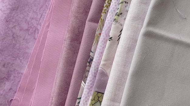
Eventually, I decided I need about this much lilac fabric!
There's a mix of fat eighths, fat quarters, yardage, and remnants, so there will end up being a different amount of each fabric in the quilt. I'm really leaning into the scrappy feeling with this selection!
I also spent a lot of time arranging the fabric into a smooth gradient from the blue lilac through the true lilac and into the pink lilac, and I think I'm finally happy with it!
I want all three of my lilac colours to flow together through a gradient so different elements of each block will become visible in different areas of the quilt. I think it will create a really interesting effect if I can work out how to do it!
Gradient Planning
I decided to try mocking up the way I want my gradient to transition.
I started by using a random number generator to plot two points on roughly opposite sides of the quilt, representing the two opposite ends of my gradient!

When I'm working with gradients, I really enjoy using imperfect symmetry to create more organic movement throughout the colours! The gradient will still move across the quilt, but it will be more of an arc than a straight line!
Looking back at my fabric for a second, I'll be using ten prints from the blue end of my gradient to represent the pattern's ice blue fabrics. They'll be laid out roughly like this:


The number of blocks I can make from each print is determined based on how much of that fabric I have available to use, so some prints will appear in as many as six blocks, while others may only end up in one or two.
I mocked up a second gradient for the nine prints on the pink end of my fabric spectrum, centred around the other point. These fabrics roughly correspond to the pinks and purples used in the original pattern.


Once again, the number of blocks of each print is based on how much of that fabric I have available.
After that, I'm left with 14 prints from the middle of my fabric gradient to use for the pattern's neutral background fabric!
To mock up the placement of that gradient, I want the colours to transition from the darkest side of my blue gradient—the top right corner of the quilt—to the darkest side of my pink gradient—the bottom left corner.


Now that I have all three gradients figured out, it's time to layer them together in the pattern mock up!

The colours in this mock up are really exaggerated so I can tell the difference between where each of my prints is supposed to end up, so it's not quite the soft and dreamy starscape I'm hoping the quilt will become, but it's definitely creating the interesting colour layering I was hoping for!
And because I'm curious, here is another mock up that should look a little closer to the finished quilt!

Of course, it doesn't have the fun pops of accent colours that I'm planning to add, but those will be sprinkled in at random, so I don't want to get too locked in on a predetermined arrangement for them.
I can't wait to see how the quilt turns out!
Friends, I have had so much fun puzzling through the fabric gradient on this quilt!
Lupine and Laughter has been such a great project so far and I haven't even started the stitching yet! But that will change very soon since I'm planning to put the final borders on Old Town this afternoon, and once I've done that, I'll be free to start piecing!
If you've been working on your own version of the Lupine and Laughter pattern, I would love to hear about your progress! Please share photos and stories in the comments below, by email, or by visiting me on Instagram!
If you're interested in making this pattern for yourself, the free version of Lupine and Laughter has recently been taken down, but it will be available for purchase on Bonnie Hunter's digital store soon!

Comments